Colony Graphs: Process Execution
In Visualizing Process Snapshots I showed processes and their parent-child hierarchy over time, using snapshots of process information. This approach misses short-lived processes that occur between the snapshots. Here I'll fill in the gaps using system tracing, visualizing all processes that occurred.
Snapshots vs Tracing

The left animation visualizes a server using process snapshots, similar to what I've done before, but this time by taking a snapshot every second instead of every minute, and displaying it at a normal rate instead of sped up. On the right is the same server during the same time, visualizing the processes using system wide tracing. This is a two second loop (click for larger). Tracing has captured many short-lived processes that were missed by process snapshots.
In the following sections I'll explore visualizing trace data using mostly images so that they can be studied more easily.
Process Snapshot
I'll begin with a process snapshot (ps -eo zone,ppid,pid,pcpu,comm) and render it as before:

This is a cloud application server that includes a web server, a database, and a ruby application.
Process Tracing
Now using system wide tracing to capture every new process for five minutes, adding them with transparent colors, dashed lines and the run time in milliseconds (click for larger):

While tracing the number of httpd and ruby18 processes were static. Short-lived processes where launched for munin (monitoring software) including munin-cron by the system scheduler (cron), and a number of "ps" processes were launched from PassengerHelperAgent.
Thermal Cam
The previous images indicate process type using color hue. The following uses only the red hue and adjusts saturation based on the run time for the short-lived processes (redder == longer). The persistent server processes have been colored flat gray (non-transparent).

Now the longer runnning short-lived processes stand out along with their children, allowing the critical path of latency to be followed. The longest running was munin-cron, launched from a cron shell (sh) taking 815 ms. Two of its children, munin-graph and fgrep, both took 311 ms, which suggests they ran together via a Unix pipe. This highlights that run time - the time from a process birth to its exit - is inclusive of wait time, in this case, the piped fgrep was likely waiting on munin-graph. A different type of time could be measured and visualized - CPU time - to reflect only the time that processes spent running on a processor.
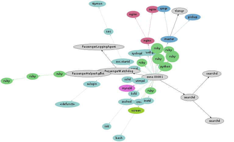
Watching Cron
Here's another example. This server was traced for five minutes:

This shows a cron scheduled task (status.sh) running every minute.
Highlighting run time:

The run time for wget is likely to be waiting on a HTTP request to complete. The nawk run time is the same as it is waiting for wget to complete, via a Unix pipe. The number of spokes from cron reflects the duration of tracing: five instances of a per-minute cron were traced.
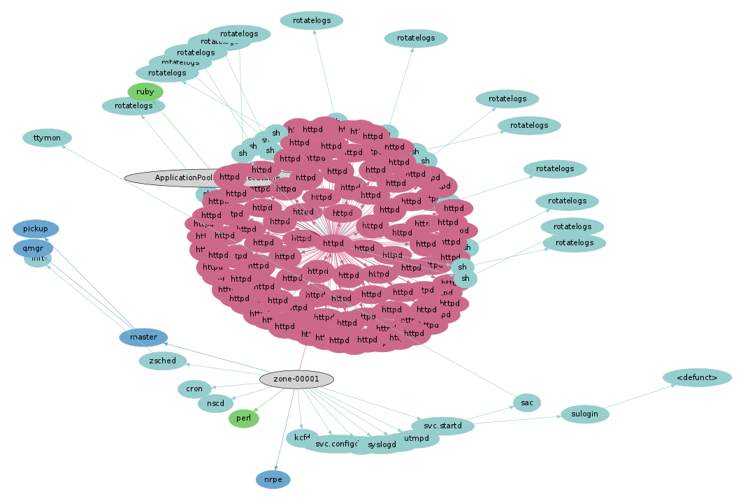
Shell Hell
Here's another system, which from a process snapshot looks like an ordinary Apache web server. Donning the thermal goggles for five minutes (click for larger):

Woah - the web server is dwarfed by a cloud of short-lived processes in the bottom left.
This cloud of processes was called from nrpe → sh → check_apache2. These are from the nagios monitoring software: nrpe is the nagios remote plugin executor, and check_apache2 is a plugin to check the health of the Apache web server. Zooming in:
The run time for check_apache2 is over 2.4 seconds, which is spent calling 500 processes. Some quick digging revealed the shell code responsible:
cpu_load="$(cpu_load=0; ps -Ao pcpu,args | grep "$path_binary/apache2" \
| awk '{print $1}' | while read line
do
    cpu_load=`echo "scale=3; $cpu_load + $line" | bc -l`
[...]
!
This was being executed every 10 minutes, on every node in a large scale cloud environment. Fortunately the 2.4 second run time wasn't all burning CPU time, as it includes a one second call to "sleep" (look closely). It was also one of the worst cases I've seen.
In the full image was another hot path on the right, which shows a check_zone_cpu process taking over one second. Its children include prstat, ghead, ggrep and gawk. These all had a similar run time, as the GNU shell commands waited on a slow prstat to complete (a "prstat -Z").
Two Seconds
I had seen another dense cloud of short lived processes from nagios, which I turned into the two second animation at the top of this page. As a thermal image, those two seconds look like this:

It looks even worse across a five minute span.
This is using the neato placement algorithm from graphvis; it's possible that other algorithms could do a slightly better job with this, however, when there are more nodes than can be placed on a canvas, some overlap is inevitable. This presents a limit to this type of visualization. A workaround was to reduce the time span, like the two second image shown above.
Application Servers
Apart from monitoring services like munin and nagios, application servers can also call short lived processes as part of their normal operation.
Ruby on RailsProcesses named mongrel_rails can be seen in this five minute image, with child processes running between 3 and 4 seconds.
Sphinx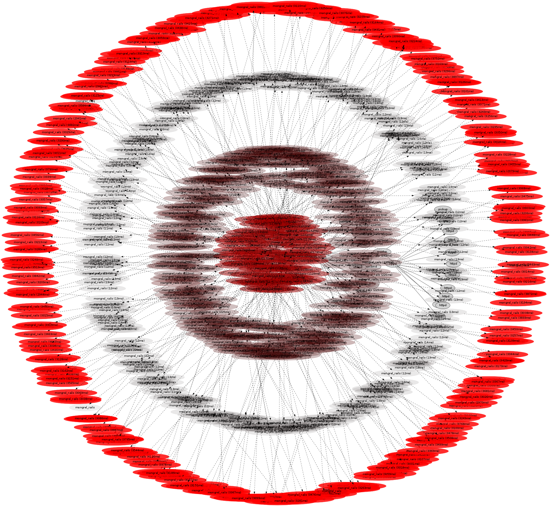
The default behavior of the sphinx search server forks a process on every request, which led to the most processes I've seen during five minutes (~17,000). It's another case where five minutes spans too many processes, and the graphing algorithm can't place them in a legible way. Here is 1/5th of a second of the same trace data as an animation, played at 1/10th normal speed (slow motion).
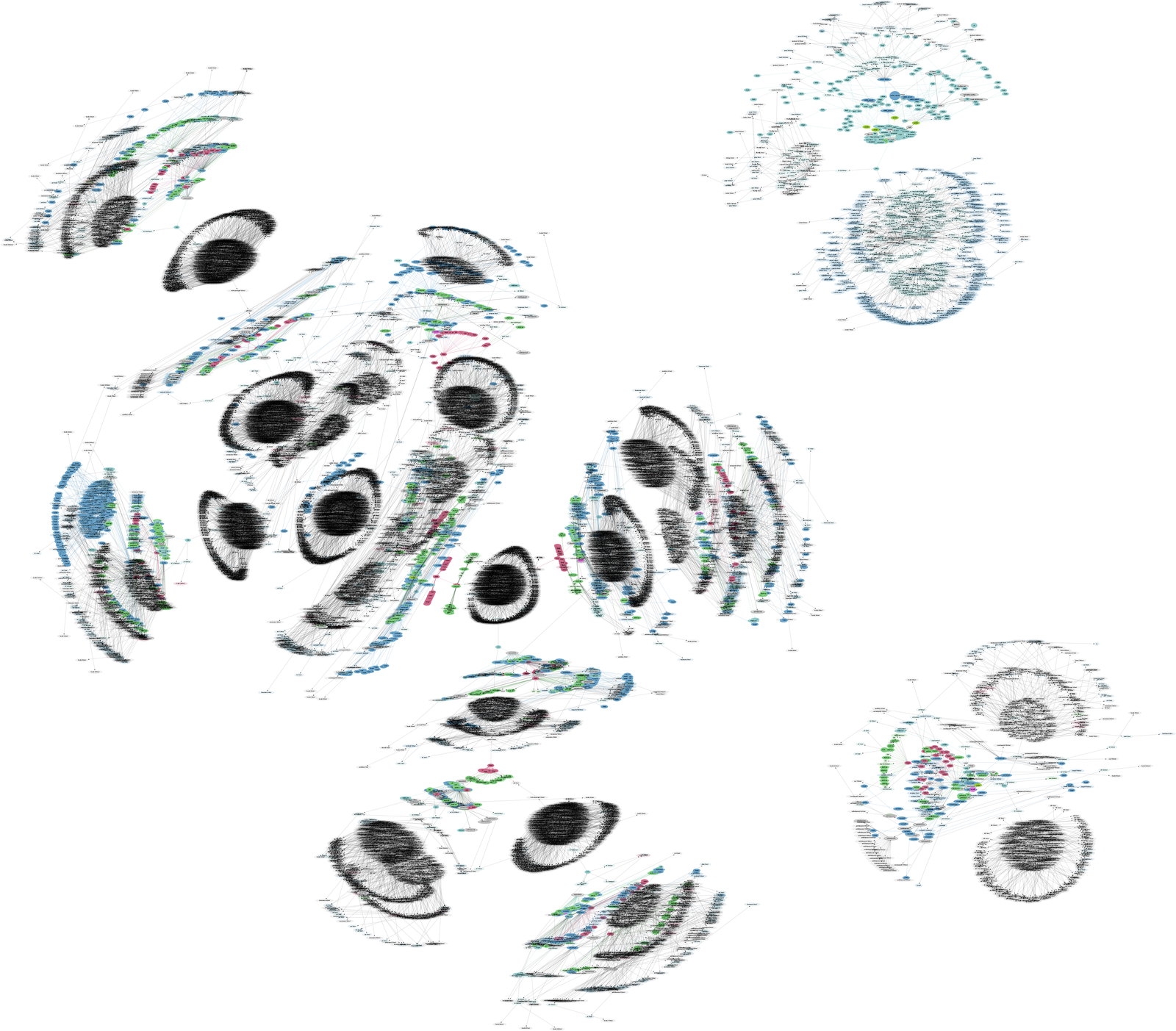
Server
As an example of scaling this visualization, here is an entire physical server that is running many small OS virtualized instances:

The large zone in the middle includes calls to jinf, a server info command, which itself makes use of child processes.
Implementation
This is an experimental visualization, so there isn't a polished tool that generates them. I've listed some summaries below, describing the data, image, and animation steps. If I get the time I'll share more code, and write up a full example.
Data Notes
The visualization data begins with a process snapshot:
# ps -eo zone,ppid,pid,pcpu,comm
      ZONE  PPID   PID  %CPU COMMAND
zone-00001     0     0   0.0 sched
zone-00001     0     1   0.0 /sbin/init
zone-00001     0     2   0.0 pageout
[...]
Then details are added using system tracing - specifically a DTrace script, processtrace.d, to add process event details in a similar format to the "ps" output, but with extra columns including nanosecond timestamps:
# ./processtrace.d
zone-00001 25822 25824 0 cpu fork - - 33352623644379691
zone-00001 25822 25824 0 awk exec - - 33352623645616308
zone-00001 25822 25824 0 awk exit 42 ms 33352623686801252
[...]
System wide tracing can log all process events, capturing information for all short-lived processes. A problem can be the data collection overhead - some tracing tools I wouldn't dare run in production as it would severely slow the target. DTrace has been designed to be production safe, and handles high rates of events with minimal overhead by using per-CPU buffers and asynchronous buffer draining. The rate of process creation - which I'd usually expect to be less than one thousand per second - should be handled by DTrace with negligible overhead.
Image Notes
These images were created using some awk to convert the process and trace data into graphviz format, and then rendered. See the cloud page for some example code. The thermal images increased color saturation (red) and reduced transparency for the longer running processes. Each image had the color scale adjusted to make best use of the range, with between 1 and 4 seconds set to be the reddest color, based on the longest run time captured in the image. For the server image, processes beyond 10 seconds run time were not colored (at that point, it's not really a short-lived process).
Tracing for long periods created a new problem that I have side stepped for now: the PID numbers can wrap. I hit this by accident a couple of times, which created bizarre connections across zones as graphviz created more than one PPID → PID arrow.
Animation Notes
The snapshot animation was just that - imaging the processes that were running at each one second instant. Each frame of the tracing animations includes all process data from the previous to the current frame, so that no information was lost. The tracing data itself is a series of process events with nanosecond timestamps, which were turned into frame data by some Perl, which loaded all the events and then stepped through time generating each frame. Because of this, the number of frames and the frame rate can be whatever is desired. All of this post-processing was done remotely - minimum overhead was induced on the production server to collect the raw data.
As mentioned in snapshots, getting graphviz to generate animations is a little tricky, and involves rendering all elements all the time, with the non-visible ones marked with the "invis" style.
Conclusion
In Visualizing the Cloud, I showed how capturing process snapshots at different scales was interesting and useful. Then in Process Snapshots I included multiple snapshots over time to see how processes change. However, I knew that this was only part of the story – we were missing the shorter-lived processes that occurred between snapshots. This page showed how to complete the picture by using tracing.
The actual data behind these visualizations is still straightforward: process status (ps) plus system-wide tracing (DTrace). Apart from the virtues of DTrace (and graphviz), the only other special technology at play here is OS virtualization, which facilitates capturing process snapshots and trace data across the cloud. The physical server image above was captured using one ps(1) and one dtrace(1M) command, which could see across all thirty active OS instances.
These new visualizations allow me to analyze the use of short-lived processes - a software inefficiency that can cause latency and poor performance. I am also able to identify other unexpected processes that aren't visible from process snapshots taken with, eg, top.
These visualizations are still experimental, intended to explore new potential tools for cloud computing analysis. With DTrace, the possibilities are vast: these visualizations were built upon only three DTrace probes (proc:::create/exec-success/exit), while the total number of probes available on these servers is over seventy thousand.
For more colony graphs, see the main page.