Heat Maps

Heat maps allow three dimensions of data to be visualized, similar to weather radar maps where color is used as a dimension. As data is quantized into buckets, they are practical for handling large datasets, such as performance monitoring metrics across thousands of servers.
The following pages introduce and demonstrate different uses of heat maps:
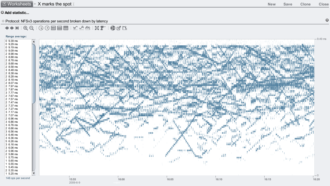
The latency heat map on the right shows the passage of time on the x-axis, disk I/O latency on the y-axis, and the frequency of disk I/O as color intensity. For more about this, see the latency page, which also has the software used to generate it.
On this page: Summary, Origin, Updates.
Summary
Heat maps are a three dimensional visualization, using x and y coordinates for two dimensions, and color intensity for the third. They can reveal detail that summary statistics, such as line charts of averages, can miss.
Their typical use is for large two dimensional datasets. The data is quantized (or "bucketized") into x- and y-ranges, shown as rectangles, with the count of data elements in each range shown as color intensity: darker for more. One dimension is often time, and the other is a performance metric of interest: latency, offset, utilization, etc. The resulting heat map shows the distribution of the performance metric over time.
I introduced and explained heat maps for latency and other performance metrics in my 2010 article "Visualizing System Latency" published in ACMQ and in Communications of the ACM, Vol. 53, No. 7, and in my USENIX LISA 2010 talk (slideshare, video). I've also described them on the latency page, which includes a Heat Maps Explained diagram.
Origin
I originally conceived latency heat maps for a Sun Microsystems performance analysis tool launched in 2008, and in the years that followed I also invented other types for computer performance analysis: resource utilization and subsecond-offset heat maps. The first deployed latency heat map tool was Analytics for the Sun ZFS Storage Appliance (the 7000 series), launched in late 2008 and first described publicly in our CEC 2008 talk Analytics in the Sun 7000 Series by Bryan and myself. It originated from a confluence of ideas: Bryan was doing most of the coding work for Analytics, and wanted develop new visualizations that better leveraged DTrace; I was trying to understand NFS performance better, especially latency outliers, and an industry friend (Jarod) suggested we visualize latency distributions over time; and I had coded DTraceTazTool in the past, which uses offset heat maps, and I thought that latency vs time should also work as a heat map. It was a very weird idea at the time.
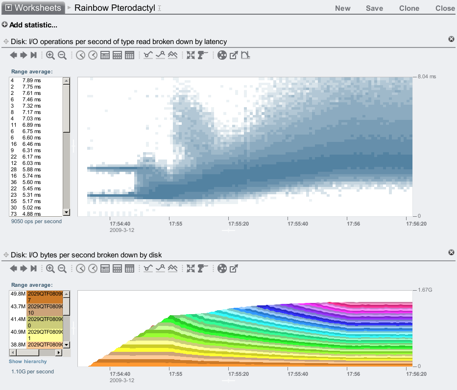
Fortunately, I found some intriguing latency heat maps early on, and used them in articles and talks to help explain and promote latency heat maps (eg, the "icy lake" and the "rainbow pterodactyl"). Nowadays, latency heat maps have become commonplace in many performance analysis tools.
Heat maps for computer performance analysis date back to at least 1995 with Richard McDougall's taztool (see my DTraceTazTool rewrite if that site is down), which used an offset heat map to visualize disk access patterns. There are older examples of disk defrag tools that use heat map-like visualizations to map disk contents: eg, Norton Disk Doctor's defrag utility from the 1980s. The heat map visualization, outside of computer performance analysis, has likely been around for hundreds of years.
Updates
- I was videoed shouting in the datacenter while demonstrating latency heat maps, which I was using to debug a benchmark regression (post). The video has now had over one million views (2008).
- I wrote a post on Heat Map Analytics (PDF), and other interesting latency heat maps: Rainbow Pterodactyl, Icy Lake, ZFS L2ARC (2009).
- I wrote an article introducing latency heat maps in ACMQ, also published in Communications of the ACM, Vol. 53, No. 7 (2010).
- Joab Jackson wrote an article in Computerworld titled Oracle engineer reveals latency mysteries with heat maps (2010).
- Joyent launched a real time cloud monitoring service called Cloud Analytics, which includes heat maps for latency and device utilization. I worked on this, and released some interesting screenshots from the prototype version (2011).
- Circonus added latency heat maps to their monitoring product; see Understanding Data with Histograms (2012).
- AppNeta included heat maps in their TraceView product (formerly Tracelytics).
More heatmaps news (updated Mar 2014):
- Voxer have heat maps in their open source Zag monitoring software.
- I wrote a simple trace2heatmap (SVG) generator in Perl and released it on github. Example output (2013).
- Datadog have added heatmaps to their performance monitoring product, which include device utilization heatmaps. I've seen an impressive demo that could show hosts on mouse-overs (2013).
- I provided an example of creating a heat map using perf_events on Linux for disk I/O latency.
More heatmaps news (updated Jul 2015):
- Alexei Starovoitov (Plumgrid) has created an eBPF heat map implementation. His example used latency on the x-axis and passage of time on the y-axis, an prints at the console. (Another example is in my blog post eBPF: One Small Step).
- Loris Degioanni (sysdig) has created a colored heat map that also prints at the console, and called it a spectrogram.
- Luca Canali demonstrated PyLatencyMap for I/O latency heat maps, which can consume data from multiple sources, including SystemTap.
More heatmaps news (updated Dec 2017):
- Abhishek Singh included latency heatmaps in the AWS X-Rap Sample App.