I've previously written about the FlameScope tool and how it can help you identify patterns in profiles, especially CPU stack samples, and from those patterns generate flame graphs. I've also spoken about the origin of FlameScope in talks; here's a quick post to share the details here as well.
1. Problem Statement
At Netflix my colleague Vadim was debugging an intermittent performance issue where application request latency increased briefly once every 15 minutes. It was a big issue. We picked one service in particular to analyze, "ums".
Here is how it looked in our cloud-wide monitoring tool, Atlas (redacted):
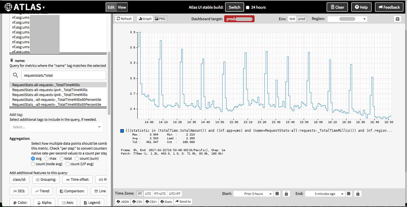
The pillars show noticeable increases in latency.
We also looked at a number of other metrics to see if there was a correlation. CPU utilization did increase a little, however, the workload (as measured by the operation rate: NumCompleted) did not.
2. Capturing a Sample
Vadim kept collecting 3-minute perf profiles while watching the Atlas latency metrics.
# perf record -F 49 -a -g -- sleep 180
# perf script > ums.stacks01
He finally saw the latency jump up while collecting a profile. We now had a 3-minute profile to study.
3. Single CPU Runs
Latency popping up every 15 minutes or so sounds like garbage collection, but it didn't match Java GC activity.
To identify the problem, I wanted to analyze the perf script output, which is essentially a list of samples with their timestamps, metadata, and stack traces. I had been working on a perf2runs tool that would identify "single CPU runs," which I'd used to find issues before (such as a code cache one I discussed at the start of my YOW! talk). But I kept thinking about other ways to slice and dice this output.
4. Slicing and Dicing into Time Ranges
I came up with another simple tool, range-perf.pl, which could filter time ranges from perf script output. I had built up a command line like this:
$ cat ums.stacks01 | ./range-perf.pl 0 10 | ./stackcollapse-perf.pl | grep -v cpu_idle | ./flamegraph.pl --hash --color=java > ums.first10.svg
I then did this in a loop and made separate flame graphs for every ten second range, hoping one would look different and explain the issue. It looked promising as it was starting to reveal some variation. I then tried a time range of one second, producing 180 flame graphs, and after browsing many of these we eventually found the issue: periodic application cache refreshes. But the whole process seemed time consuming, and had a granularity of one second. What if I needed 100 ms flame graphs to really focus on the perturbations? There would be way too many flame graphs to browse through (1,800).
5. Visualizing CPU Utilization Down to 20 ms
We knew there was a slight correlation with CPU utilization, and in a way that information is captured in the perf profile (by filtering out idle samples). If we could visualize the CPU utilization in the profile over time, we could then select the most interesting ranges for a flame graph. I tried line graphs first, but ultimately found my subsecond-offset heat map visualization to be most useful as it revealed more patterns and easily visualized down to the 20 ms range. It looked like this (svg):

If you click this svg you should get some interactivity with this visualization, where you can hover over pixels and see time and sample counts. It's showing seconds as full columns, painted bottom to top, and fractions of seconds as the rows. The color depth shows how many CPU samples fell into each range. Each of these blocks represents about 20 milliseconds in time. (See subsecond-offset heat map for a greater explanation.)
There are three patterns in the above visualization:
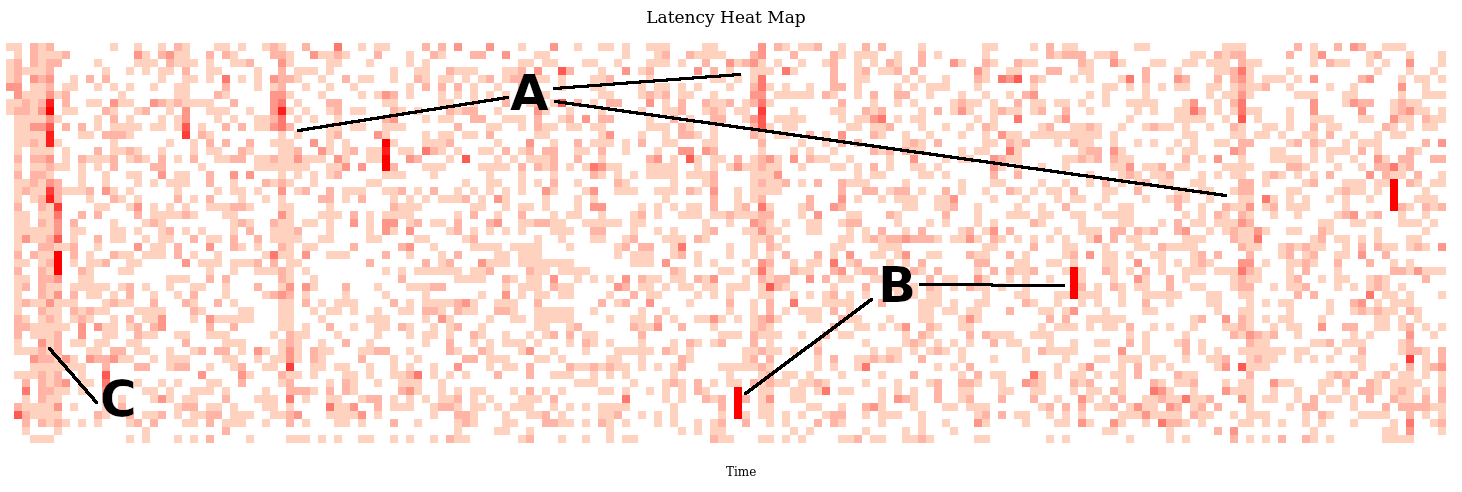
A) Three vertical bands of higher CPU usage spaced 60 seconds apart
B) Various short bursts of about 60 milliseconds of high CPU usage, appearing as short red stripes.
C) A burst of CPU usage at the start of the profile (perf doing some initializing? Surely not).
6. FlameScope
I enhanced this visualization so that we could click on time ranges and it would produce a flame graph just for that range. We called this tool "FlameScope" (my prototypes). That way we quickly identified what all of these were:
A) Servo (Atlas monitoring)
B) Garbage collection
C) An application cache refresh
It was (C) we had found earlier the hard way by slicing and dicing the perf profile. It was far far easier to just "see it" in the heatmap and select that range. I used this same profile for many of other talks and blog posts about flame scope.
Martin Spier and myself (mostly Martin) then rewrote this into Netflix FlameScope, published on github.