
I originally posted this at http://blogs.sun.com/brendan/entry/status_dashboard.
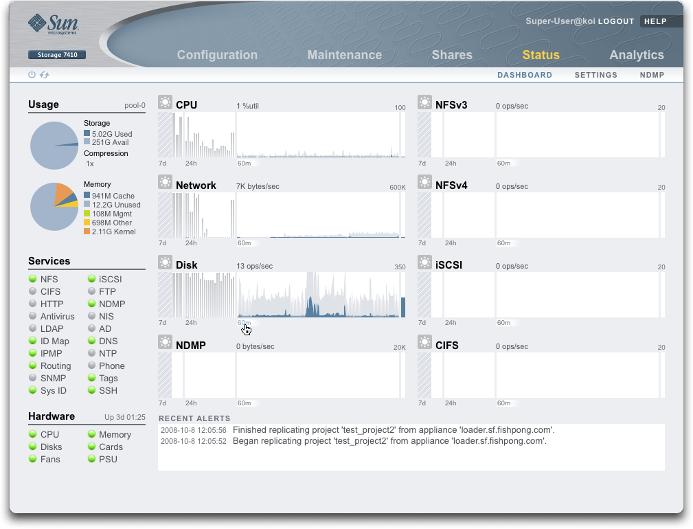
In this entry I'll write about the Status Dashboard, a summary of appliance status written by myself and the Fishworks engineering team for the Sun Storage 7xxx series of NAS appliances (released today). This is of interest beyond the scope of NAS, as a carefully designed solution to a common problem: summarizing the status of a complex system.
Click the screenshot for a larger version
Key Features:
- Five areas of status:
- Usage - disk storage and main memory usage, broken down into components
- Services - status of system services
- Hardware - status of hardware
- Activity - (top right) shows current and historic activity of eight different metrics
- Recent Alerts - most recent system alerts
- Everything is updated live
- Everything is clickable, switching to screens with more details
Motivations
The dashboard is the union of both technical and graphical expertise. I'll talk about the technical aspects in this blog entry, and Todd (Fishworks graphics designer) can talk about the design and graphics used, which have been chosen to be consistent with the rest of the appliance.
I have a particular interest in observability tools (I discuss many in the book Solaris Performance and Tools), and my most recent project before joining Sun was the DTraceToolkit. But the most valuable experience for developing the dashboard was from the time that I (and the Fishworks team) have spent with customers to see what does and what doesn't work. What I've learned most from customers is that having a performance tool, even a useful performance tool, is only part of the problem; the tool must also be understood by the end-users, and help them understand system performance without being confusing.
Another motivation was to use a GUI to add value to the data, and not just repeat what can be done in text at the CLI. This includes making everything clickable to take the user to screens for more information, using icons to summarize states, graphs to plot data, and locating these elements in the GUI to improve readability.
I'll discuss each area of the dashboard, as a tour of the interface and to discuss some technical points along the way.
Usage
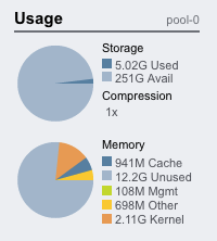
The Usage area shows usage of the storage pool and main memory. The values are listed and represented as pie charts.
Pie charts work well here, not only because we have known maximums for both storage and memory to divide into slices, but also for the visual effect. I've seen dashboards covered in the same style indicator for all statistics (eg, a page of strip charts and nothing else). It is uninteresting and makes it difficult to remember where certain information is displayed. Here it is easy to remember where the usage status is shown: look for the pie charts.
For the storage section, both used and available space are displayed as well as the current achieved compression ratio. Clicking the pie chart will take you to the storage section of the interface where consumed space can be examined by share and project.
The memory section shows how main memory (RAM) is consumed. Clicking this will take you to the Analytics section where this data is graphed over time.
Services
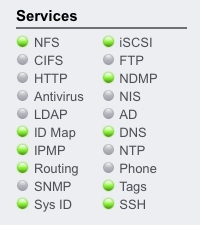
The Services area shows the status of the system services with traffic lights to show the status of each. The traffic light will either be:
 online
 disabled - not yet enabled by the administrator
 offline - may be waiting for a dependant service to start
 maintenance - service has a current fault and is offline
Traffic lights work well here as these services have distinct states as defined by SMF (Service Management Facility from Solaris 10). Clicking either the name or the icon will take you to the service screen where its properties and logs can be examined.
This is worth repeating: if you see a service in a maintenance state, one click takes you to its properties and logs for troubleshooting, as well as controls to restart the service. This makes it possible to administer and maintain these services without any specific SMF or Solaris knowledge – a common aim of the appliance interface.
Hardware
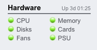
Like Services, the Hardware section uses traffic lights to summarise the status of key hardware components. If clustering is configured, and extra light is displayed for cluster status. The status is mostly retrieved from FMA (Fault Management Architecture from Solaris 10).
Clicking on these icons will take you to the Hardware View: a section of the appliance with interactive digital views of the hardware components.
The system uptime is displayed in the top right.
Activity
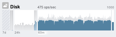
This is the largest section on the dashboard, and graphs activity across several performance statistics (disk I/O shown here as an example).
There are no traffic lights used. Instead, I have used weather icons at the top left. Traffic lights indicate what is good or bad (green or red), which can be determined for hardware or services where any fault is bad, but can be inaccurate when quantifying performance activity statistics. This is due in part to:
- Different customer environments have different acceptable levels for performance (latency), and so there is no one-size-fits-all threshold that can be used.
- The displayed statistics on the dashboard are based on operations/sec and bytes/sec, which do not scale properly with performance issues.
The weather icon displayed is based on configurable thresholds, and the average value from the last 60 seconds; click the icon to go to the configuration screen, shown below.
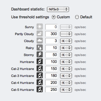
The reason for this activity icon is to grab attention when something is unusually busy or idle, and needs further investigation. Weather icons do this fine. If an activity becomes stormy or beyond (that normally isn't), I'll take a look.
I've seen performance dashboards that use traffic lights based on arbitrary values, that for some environments and workloads can display green (good) when performance is bad, and red (bad) when the performance is good. We wanted to avoid this!
In this model there is no good/bad threshold, rather a gradient of levels for each activity statistic. This avoids the problem of picking an arbitrary threshold for good/bad, and allows a more realistic gradient to be chosen. Weather itself is suitable for an additional reason: weather as a metaphor implys a non-exact science.
The statistics these are based on are an approximate view of performance, since they are based on ops/sec and bytes/sec and not measures of latency. The dashboard deliberately uses these statistics since:
- They can work fine in many situations
- The dashboard links to appliance Analytics to provide a better understanding of each resource (including latency)
- They are commonly understood (disk ops/sec, network bytes/sec)
The default thresholds have been based on our own performance benchmarking, which under the heaviest load will drive each activity into the CAT-* hurricanes. (If you get to a CAT-5 hurricane under a normal production workload, let me know.)
Back to the activity panel: In the middle are four graphs of recent activity over different time intervals, all drawn to the same vertical scale. From left to right are: 7 days, 24 hours, 60 minutes, and the instantaneous 1 second average (average is blue, maximum gray). Having the historic data available helps indicate if the current activity is higher or lower than normal: normal being the graph for the previous 24 hours or 7 days.
The labels beneath the graphs ("7d", "24h", "60m") are clickable – this will change the vertical scale on all graphs to the maximum for the clicked range, also helping the user quickly compare the current activity to the past; it will also change the average value in the middle top (in this example, "475 ops/sec") to be the average for the range selected.
Clicking each graph will take you to Analytics for that statistic and time range, where each statistic can be understood in more detail. For example, if you had an unusual number of NFSv3 ops/sec, you could use Analytics to see which files were hot, and which clients.
Note that the 7d and 24h graphs use bars instead of a line, where each bar represents 1 day and 1 hour respectively.
The activity statitstics displayed are configurable from the Status->Settings section, which allows each of the 8 activity sections to be configured. It is possible to set sections to empty; your server may never use iSCSI, NDMP or NFSv4, so setting these sections to empty will improve load time for the dashboard (since the dashboard is dozens of png images – all of which must be loaded and refreshed.)
Recent Alerts
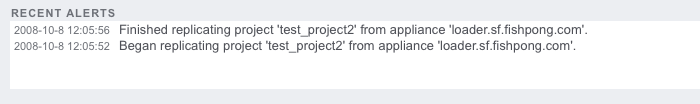
This section shows the most recent alerts from the appliance alerts logging system. Clicking the alert box will take you to the alerts log viewer, where each can be examined in more detail.
About the CLI?
The Fishworks appliance software has a CLI interface, which mirrors the BUI (Browser User Interface) as much as possible. The Dashboard is a little tricky as it has been designed to be a visual GUI, and contains elements such as graphs that don't translate directly to text (although we might try aalib at some point). Despite this, much of the data can be printed, and a CLI version of the dashboard has been provided. This is how it currently looks:
walu:> status dashboard
Storage:
   pool_0:
      Used     10.0G bytes
      Avail    6.52T bytes
      State          online
      Compression    1x

Memory:
   Cache        550M bytes
   Unused       121G bytes
   Mgmt         272M bytes
   Other       4.10G bytes
   Kernel      1.90G bytes

Services:
   ad                disabled               cifs              disabled
   dns               online                 ftp               disabled
   http              online                 identity          online
   idmap             online                 ipmp              online
   iscsi             online                 ldap              disabled
   ndmp              online                 nfs               online
   nis               online                 ntp               online
   routing           online                 scrk              maintenance
   snmp              online                 ssh               online
   tags              online                 vscan             online

Hardware:
   CPU               online                 Cards             online
   Disks             faulted                Fans              online
   Memory            online                 PSU               online

Activity:
   CPU             1 %util                  Sunny
   Disk           32 ops/sec                Sunny
   iSCSI           0 ops/sec                Sunny
   NDMP            0 bytes/sec              Sunny
   NFSv3           0 ops/sec                Sunny
   NFSv4           0 ops/sec                Sunny
   Network       13K bytes/sec              Sunny
   CIFS            0 ops/sec                Sunny

Recent Alerts:
   2008-10-13 07:46: A cluster interconnect link has been restored.
Conclusion
We set out to summarize the entire system on one screen, and provide links to the rest of the interface. We are happy with how it turned out, and not just having fit the information in, but also having used features that a GUI allows to make this a powerful and intuitive interface.
For more information about appliance activity analysis, see the presentation on Analytics.