

I originally posted this at http://blogs.sun.com/brendan/entry/latency_art_rainbow_pterodactyl.
In previous posts I've demonstrated Analytics from the Sun Storage 7000 series, which is a DTrace based observability tool created by Bryan. One of the great features of Analytics is its use of heat maps, especially for I/O latency.
I/O latency is the time to service and respond to an I/O request, and since clients are often waiting for this to complete, it is often the most interesting metric for performance analysis (more so than IOPS or throughput). We thought of graphing average I/O latency, however important details would be averaged out; occasional slow requests can destroy performance, but when averaged with many fast requests their existence may be difficult to see. So instead of averaging I/O latency, we provide I/O latency as a heat map. For example:
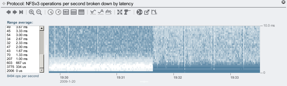
That is showing the effect of turning on our flash based SSD read cache. Latency drops!
The x-axis is time, the y-axis is the I/O latency, and color is used to represent a 3rd dimension: how many I/O requests occurred at that time, at that latency (darker means more). Gathering this much detail from the operating system was not only made possible by DTrace, but also made optimal. DTrace already has the ability to group data into buckets, which is used to provide a sufficient resolution of data for plotting. Higher resolutions are kept for lower latencies: having 10 microsecond resolution for I/O times less than 1,000 microseconds is useful, but overkill for I/O times over 1,000,000 microseconds (1 second), and would waste disk space when storing it. Analytics automatically picks a resolution suitable for the range displayed.
In this post (perhaps the start of a series), I'll show unusual latency plots that I and others have discovered. Here is what I call the "Rainbow Pterodactyl":
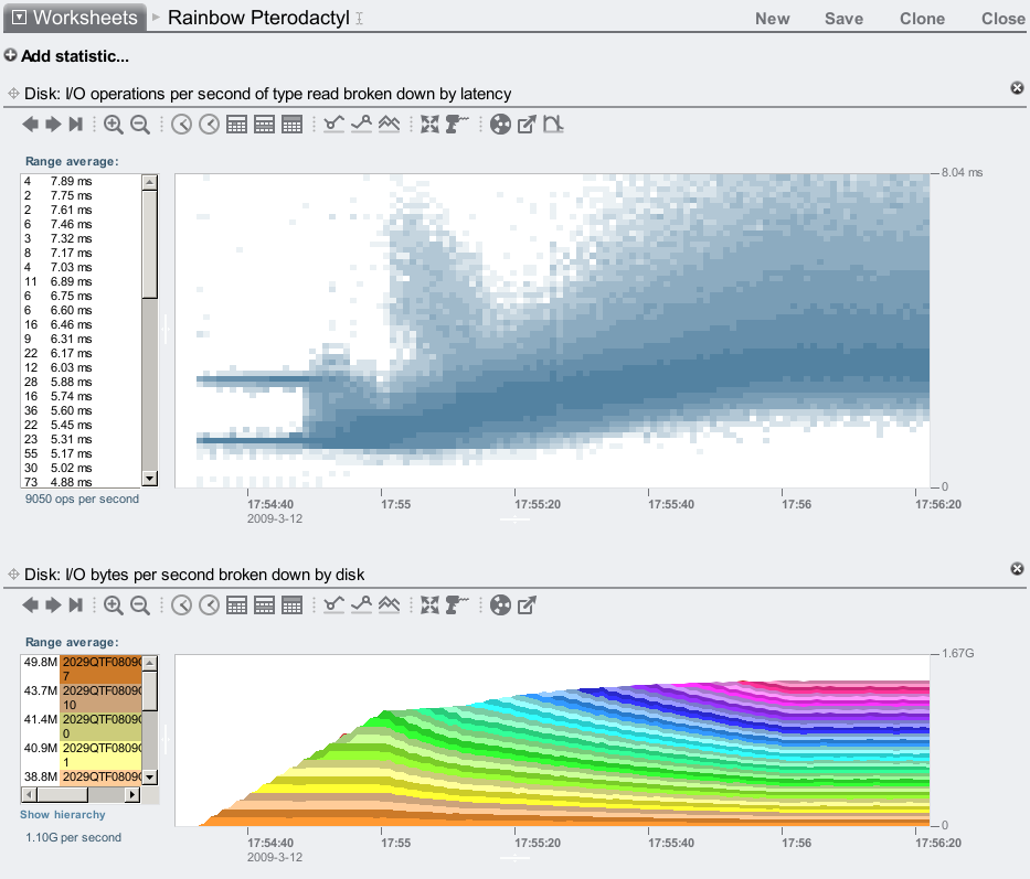
Yikes! Maybe it's just me, but that looks like the Pterodactyl from Joust.
I discovered this when testing back-end throughput on our storage systems, by 'lighting up' disks one by one with a 128 Kbyte streaming read workload to their raw device (visible as the rainbow). I was interested in any knee points in I/O throughput, which is visible there at 17:55 where we reached 1.13 Gbytes/sec. To understand what was happening, I graphed the I/O latency as well, and found the alarming image above. The knee point corresponds to where the neck ends, and the wing begins.
Why is there a beak? (the two levels of latency) ... Why is there a head? Why is there a wing? This raised many more questions than answers – things for us to figure out. Which is great. Had this been average latency, these behaviors may have gone unnoticed.
I can at least explain the beak to head threshold: the beak ends at 8 disks, and I had two "x4" ports of SAS connected, so when 9 disks are busy there is contention for those ports. (I'll defer describing the rest of the features to our storage driver expert Greg if he gets the time. :-)
The above was tested with 1 SAS path to each of 2 JBODs. Testing 2 paths to each JBOD produces higher throughput, and latency which looks a bit more like a bird:
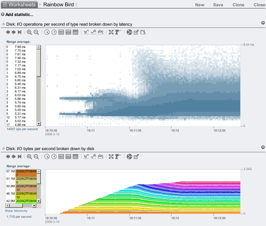
Here we reached 2.23 Gbytes/sec for the first knee point, which is actually the neck point...
Latency heat maps have shown us many behaviors that we don't yet understand, which we need to spend more time with Analytics to figure out. It can be exciting to discover strange phenomenons for the first time, and it's very useful and practical as well – latency matters.