

I originally posted this at http://blogs.sun.com/brendan/entry/visualizing_system_latency.
I've just had an article published in ACMQ: Visualizing System Latency, which demonstrates latency analysis using heat maps in Analytics from Oracle's Sun Open Storage appliances. These have revealed details about system performance that were previously not visible, and show how effective a simple visualization can be. As many of these details are new, they are still being studied and are not yet understood.
One detail now can be understood, thanks to Pete Harllee who offered an explanation for the faint line at the top of Figure 4: these I/O are where the lba range spans two tracks in the drive (which I should have realized can happen sooner since these are 8 Kbyte writes on a drive with 512 byte sectors); the additional latency encountered is the expected track to track seek time during the I/O, as the lbas are written to one track and then complete writing on the next.
The resolution of the screenshots was reduced to fit the online article, which preserved the patterns that the article was describing but not ancillary text; the original resolution screenshots are linked in the article, and are also listed here:
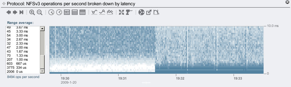
Figure 1: NFS Latency When Enabling SSD-based Cache Devices
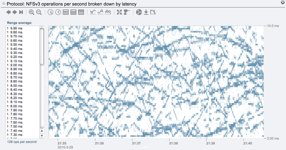
Figure 2: Synchronous Writes to a Striped Pool of Disks
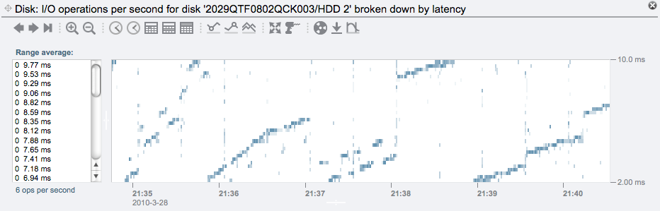
Figure 3: Single Disk Latency from a Striped Pool of Disks
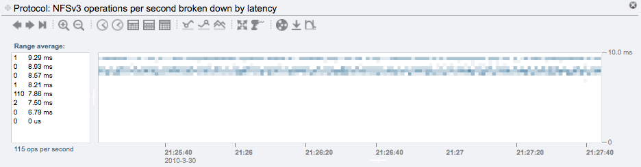
Figure 4: Synchronous Write Latency to a Single-disk Pool
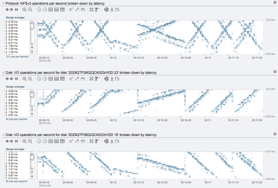
Figure 5: Synchronous Write Latency to a Two-disk Pool
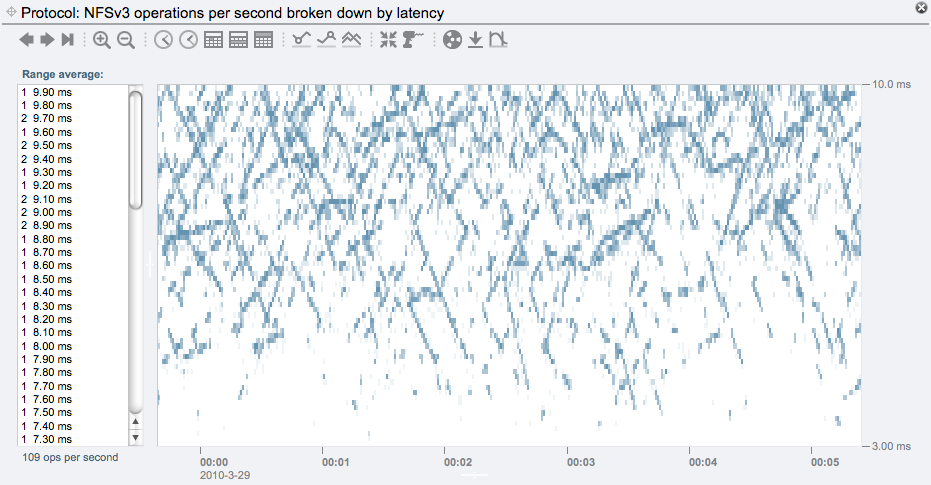
Figure 6: Synchronous Writes to a Mirrored Pool of Disks
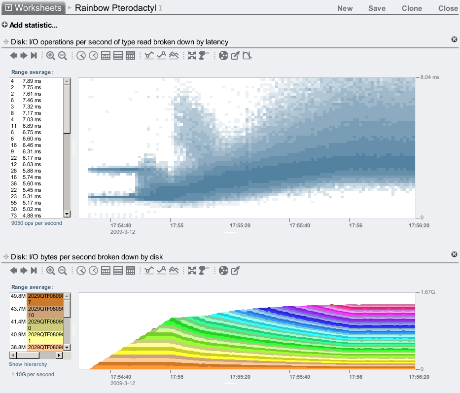
Figure 7: Sequential Disk Reads, Stepping Disk Count
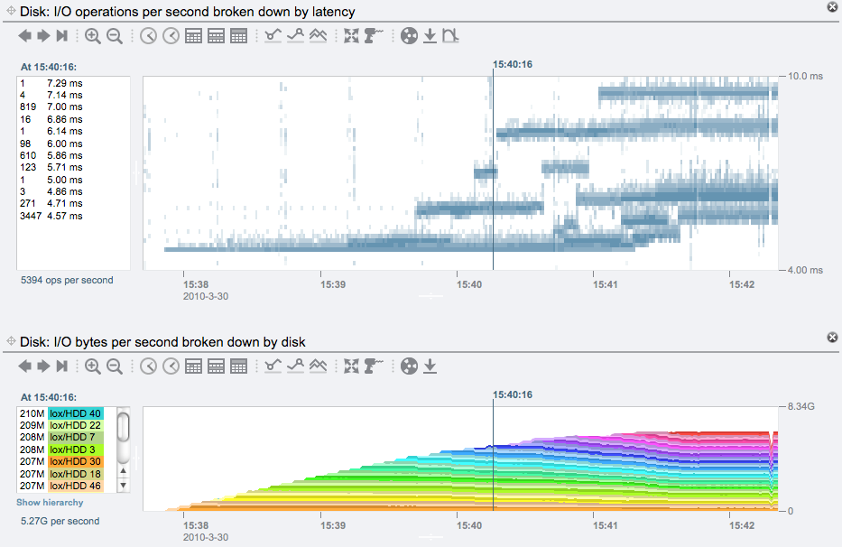
Figure 8: Repeated Disk Reads, Stepping Disk Count
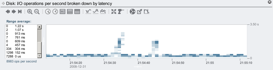
Figure 9: High Latency I/O
The article has been picked up by sites including Slashdot and Vizworld.